MODERNIZING LIFE SNAPSHOT’S WEB APPLICATION
Client:
Life Snapshot (Live)
My Roles:
UX design
UI design
Summary:
Life Snapshot is a digital vault that consolidates important after-life information that is shared amongst family members after one has departed. The company aims to give ease through unexpected times.
As the product designer, I re-designed the web application for Life Snapshot.
01 Problem Statement
Life Snapshot wants their brand values to match their product
Through different stages in life unexpected or planned - Life snapshot wants users to put their trust in their platform.
Design is a big component in capturing trust. It is the first introduction to a product and more often than not first impressions are everything. Life Snapshot’s current web application though functional, lacked a modern identity and empathetic voice which was intrinsic to the company’s mission and values.
Life Snapshot Brand Values
02 Discovery
What Is Currently Working And What Is Not
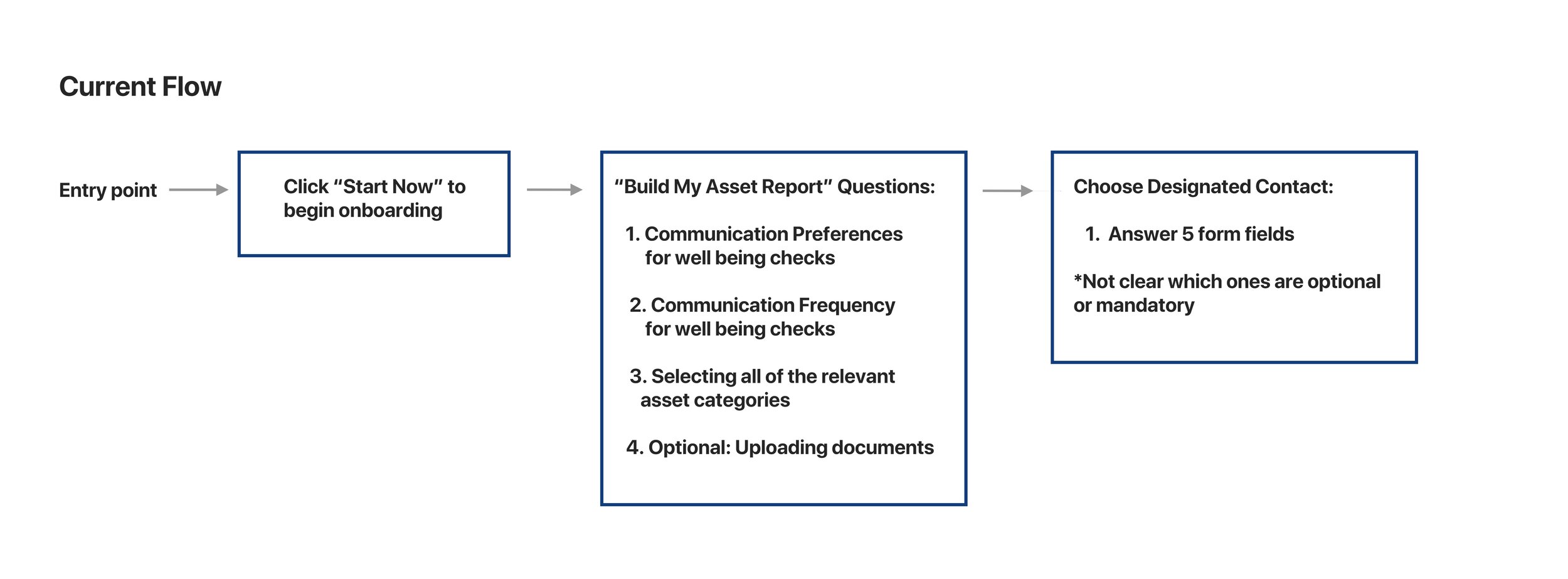
Due to the quick nature of the project, I had limited time with the client. Every meeting had to be intentional and purposeful in trying to know the ins and outs of Life Snapshot. It was also specifically important to me to know how the client and their users perceived Life Snapshot’s web-application and if they matched or differed. Through user tests and research, it became apparent that there were incorrect assumptions and misaligned expectations about user behavior. Life Snapshot’s onboarding had the bulk of the issues. Though organized and professional, it was not as helpful as the client originally perceived it to be.
Onboarding is one of the important phases of a user’s journey. Think of onboarding as meeting someone new. In the world of technology, it is the first point of contact with your target audience where you are required to make a good impression. The client markets Life Snapshot’s onboarding as easy as three simple steps. However, the current flow does not imply that.
Life Snapshot Onboarding Usability Test
82.3% of user feedback indicated that the current Life Snapshot web-application was unintuitive, robotic and lacked empathy
77% of participants were keen on a modern design overall
Visual Competitive Analysis
Exploring competitors to determine how to best set Life Snapshot apart and what successful patterns could be adopted.
Looking into different competitors that have similar offerings as well as brand values. I have found three direct and three indirect competitors. I then noticed two axes of comparison to use as groundwork for my designs.
Life Snapshot re-design aims to be modern and formal
The current brand and web-application leans more towards traditional and very formal. Having spoked to my client and taking in my prior research, I concluded it was best to align Life Snapshot as a modern but formal design. Not only does this keep up with the current times but also make sure their trustworthiness as a brand stays in tack.
03 Design
Creating the Design Framework
After taking in our preliminary research and findings which provided me the creative groundwork for the project. It is now time to color in the lines and give the project life.
Moodboards
I used the Microsoft Reaction Card Method to test visual appeal. The major benefit of this methodology is that it introduces a controlled vocabulary for participants. The variability in word choice that naturally occurs during free-form qualitative evaluation can be problematic for data analysis.
I then gathered all my data and created an affinity map for all my moodboard designs to help narrow down my design direction. The client loved their current colors of blue, gray and white so I kept the blue consistent on all three moodboards but wanted to show them different possibilities through various color schemes. I wanted my moodboards to be as divergent as possible and the client appreciated seeing different styles come to life.
Style Tile
I was not able to test my style tiles due to time constraints but having direct feedback from the client assured me that I was going in the right direction.
Quotes from Client:
“I like the colors here”
“The design we would like to see happen”
“Checklist graphic is a nice touch”
04 Solution
By creating a flow that shows apparent and clear steps, users are able to feel assured throughout the onboarding process. Not only does that create a seamless flow but also builds upon their brand values of empathy, helpful and trustworthy.
High Fidelity Screens Iteration #1
Round 1 of Desirability Test User Insights:
Participants responded well to a modern design
Participants understood clearly that onboarding just took three simple steps
Participants preferred pops of color throughout the design
Participants felt there was too much space being occupied by the navigation bar
High Fidelity Screens Iteration #2
Round 2 of Desirability Test User Insights:
“It’s very aesthetically pleasing” (converted user through iteration)
“Minimalist but modern”
Hit 4/5 brand values: Empathetic, Helpful, Trustworthy and Professional
05 Results:
MVP prototype video of Life Snapshot.
I would dedicate more time on conducting proper user testing on user flows such as the financials and dashboard.
“life snapshot 2.0”
— Cheri Williams-Franklin, CEO of Life Snapshot06 Reflection
Bias for Action is Key
This project was a great reminder that speed matters in business. Taking action quickly and pulling the trigger fearlessly. At the beginning of the project, I was constantly worried of not delivering the “perfect” deliverables and realized instantly that this mindset became a roadblock to success. Given the tight deadlines, I needed to act autonomously on many different areas of the project even if I was not sure what the outcome was going to be. Guided by research and a well though out process, I was able to come up with the final design of Life Snapshot. While I felt like some of the more ambitious and interesting design explorations were passed over due to various constraints, what shipped was a design that showed the client the possibility of what their product could be.


